Do you know how big the world actually is?
If you take a look at the map below, you will probably think Greenland is a tad larger than Africa. Their shapes even look quite similar, don’t they? But which one is actually bigger?
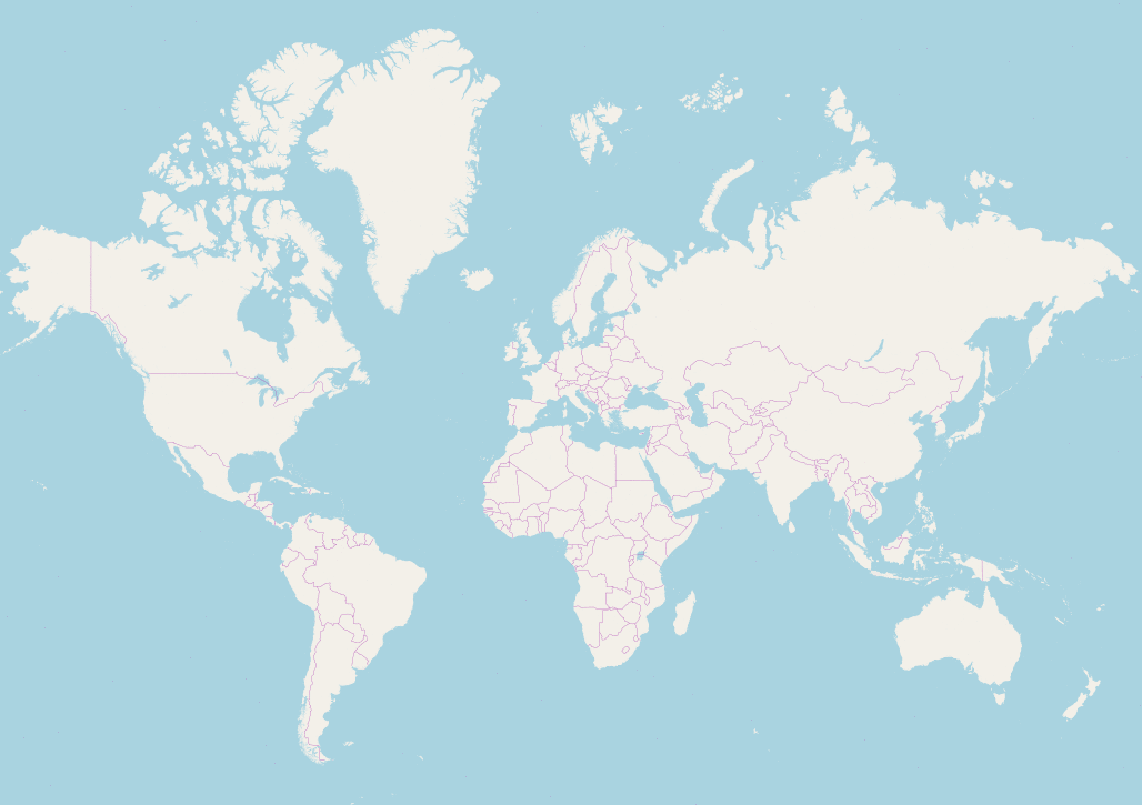
The answer might surprise many people — and it also reveals just how misleading our most common maps can be. The correct answer is Africa, of course. Africa has a larger landmass than Greenland. Much larger.
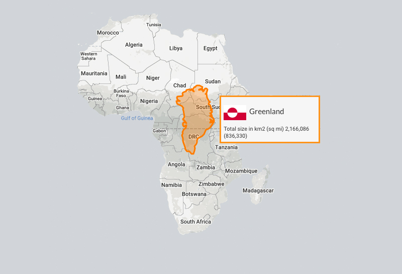
The African continent, with its 30,365,000 sq km, is more than 14 times larger than the island of Greenland, which covers just 2,166,000 sq km. In fact, the African continent is larger than the USA, China, India, Japan, and Europe — combined!
Check out this “true size” projection of Greenland overlaid on Africa. It really puts things into perspective.
But why does Greenland look so massive on the world map?
This is due to how landmasses are represented on the common Mercator projection map. When the curved surface of the Earth is projected onto a flat 2D plane, areas near the poles get stretched and appear far larger than they actually are — which is why Greenland looks almost as big as Africa, when in reality it’s a fraction of the size.
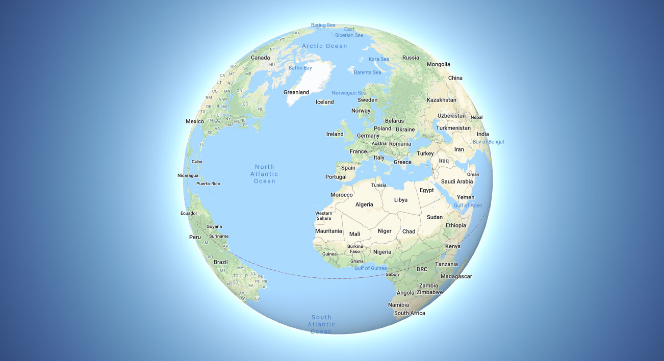
To get a better sense of the true sizes of countries, I’d suggest looking at a physical globe. Alternatively, you can use Google Maps — just make sure to enable the “Globe” view, which gives a much more accurate, spherical representation of the world.
Visit The True Size of to generate your own size projection map. You can even overlay multiple countries to get a true sense of just how vast the world really is. Happy mapping!
Update — September 2026: The UN Votes to Correct the Map
The United Nations General Assembly passed a landmark resolution calling for the global adoption of the Equal Earth projection — and with it, a move away from the Mercator map that has dominated classrooms and screens for centuries.
The resolution, led by Togo and backed by the African Union, doesn’t outright ban Mercator. But it calls on governments, schools, international organisations, and technology companies to use equal-area projections wherever the true scale of continents matters.
The Greenland vs. Africa comparison you’ve seen on this page is a perfect example of why this matters. A map is never neutral — and now, the world’s highest diplomatic body agrees.


